BrandingAsker Nett
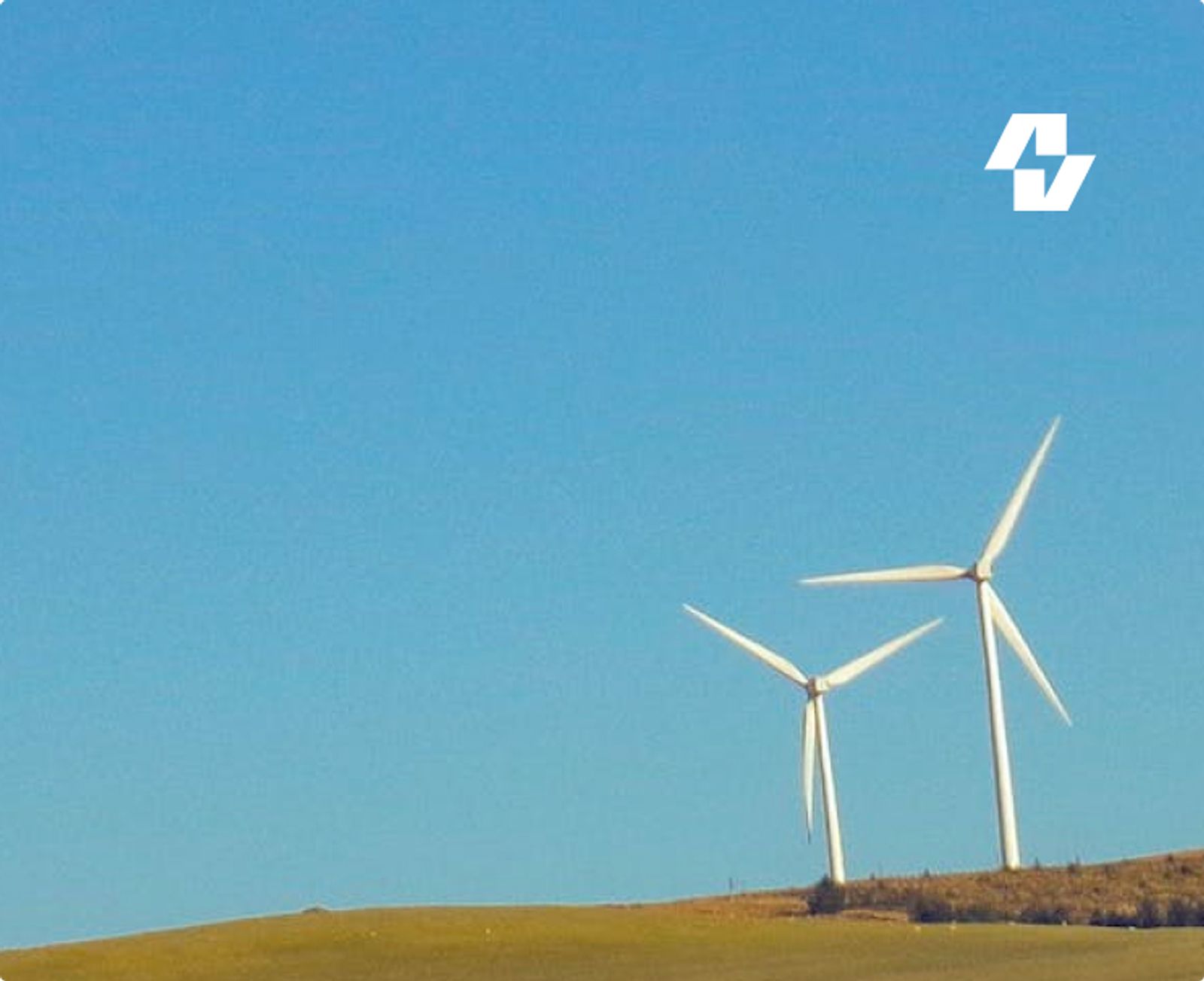
Electric design for one of Norway's leading energy providers.
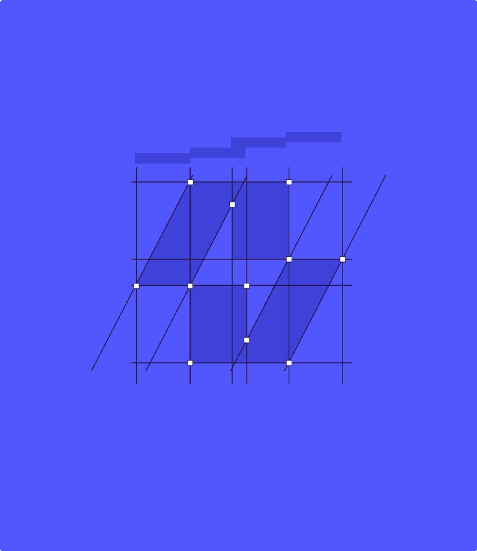
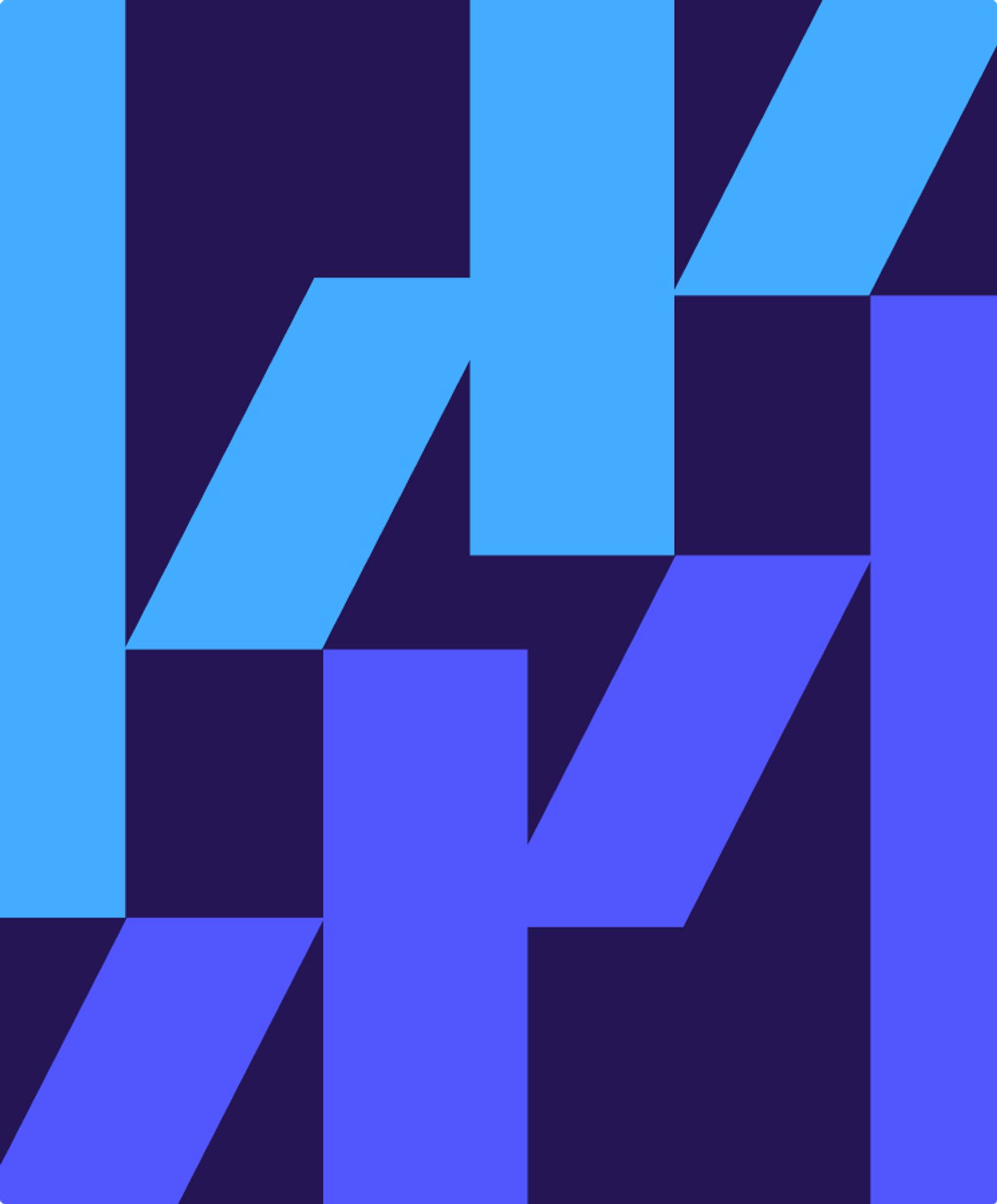
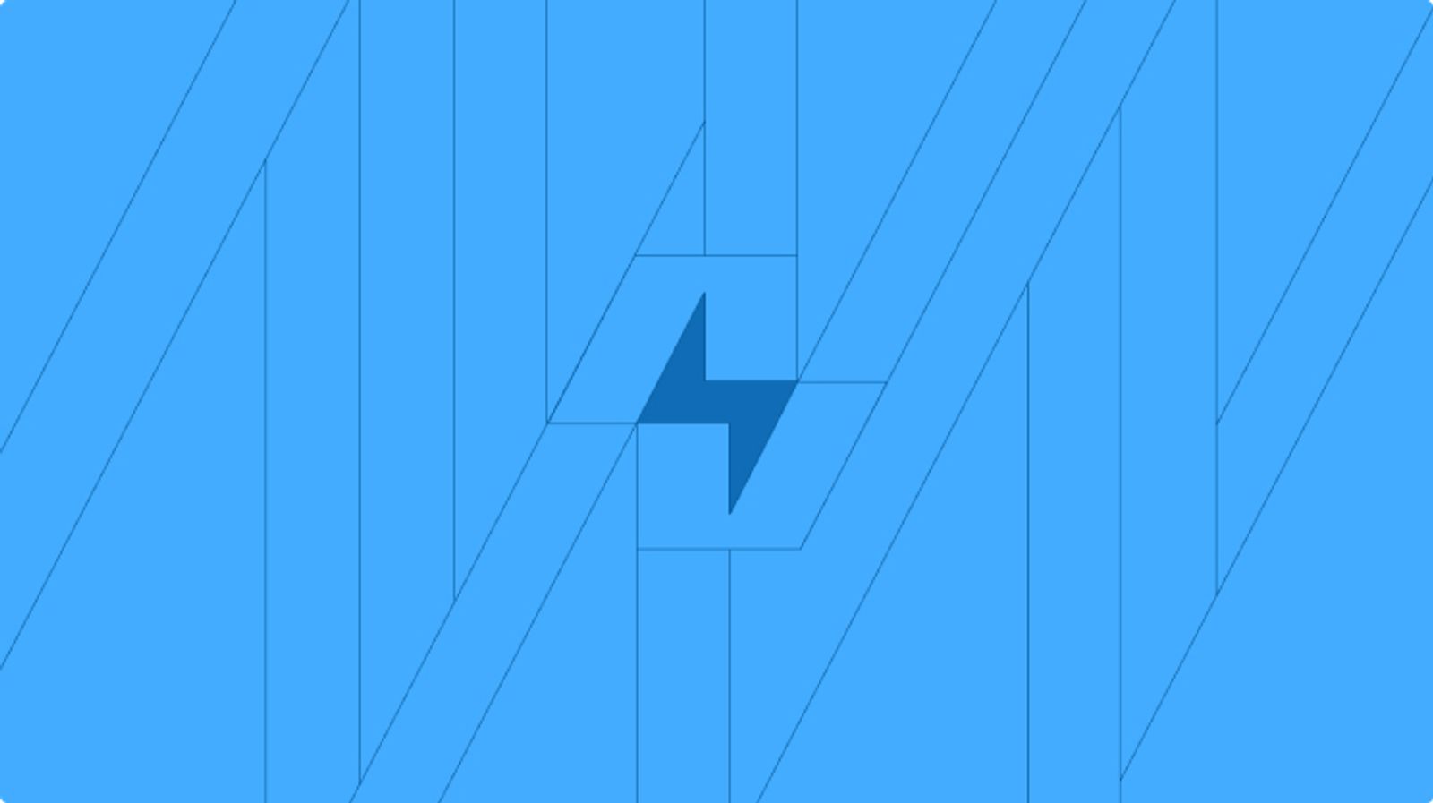
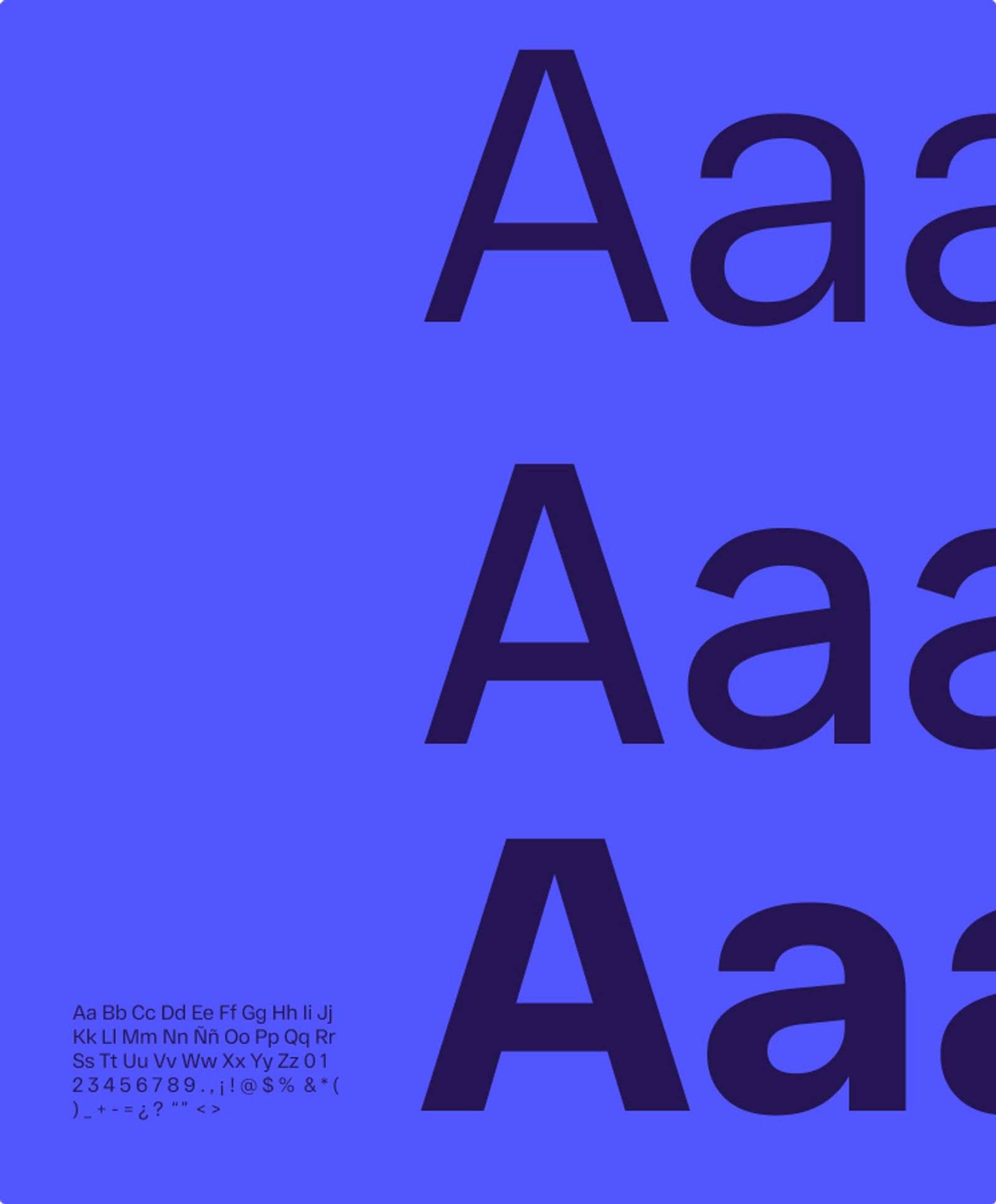
A brand rebuild for Asker Nett: a lightning-bright colour palette, a geometric line system, and a modernised identity for a company powering a large part of Norway.
Art DirectionBrand DesignIcon System
- Client
- Asker Nett
- Project scope
- Art Direction · Brand Design · Icon System
- Project Lead
- Jonatan Hinnenthal
- Year
- 2023

The transformation
From a dated mark to a clear language of energy.
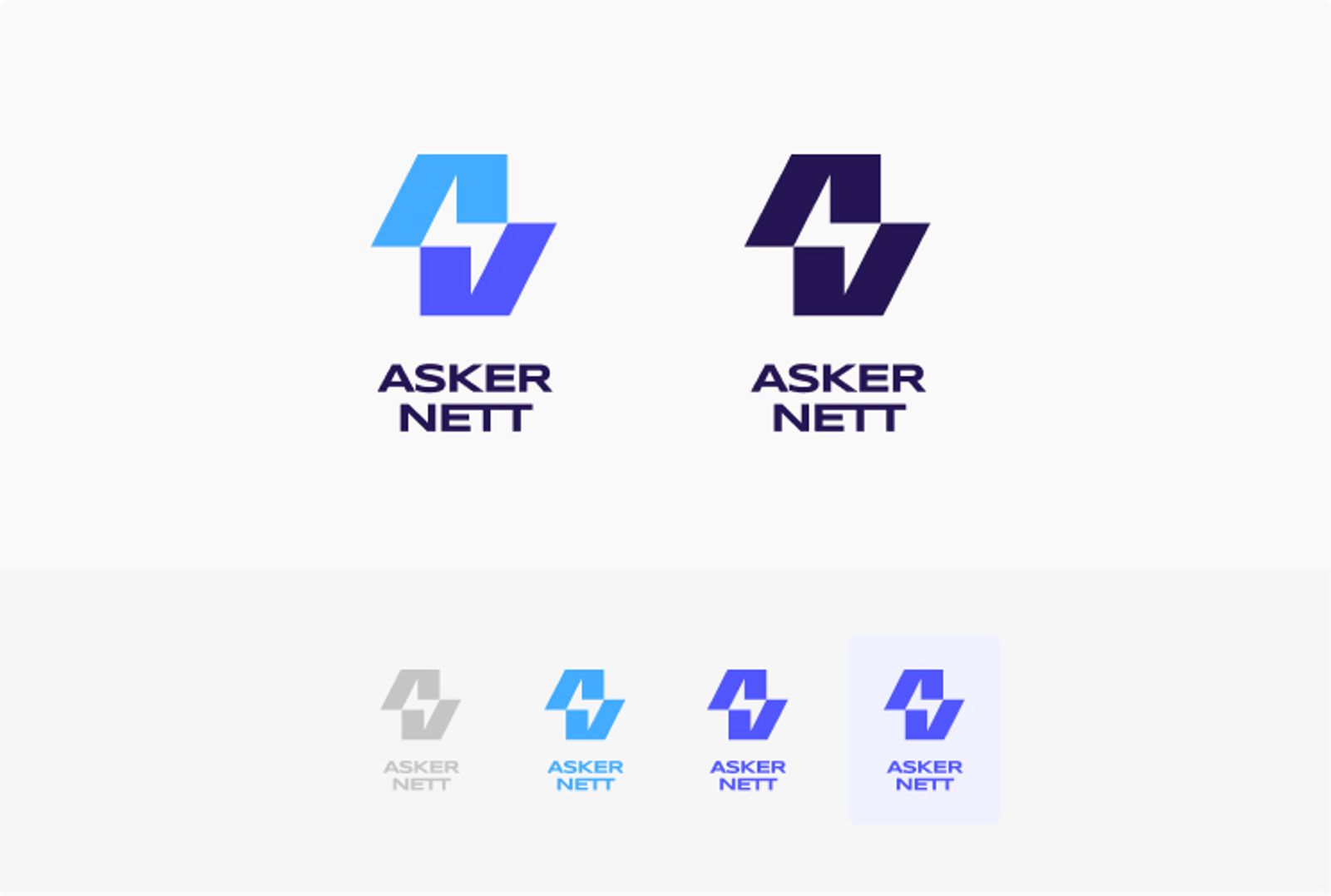
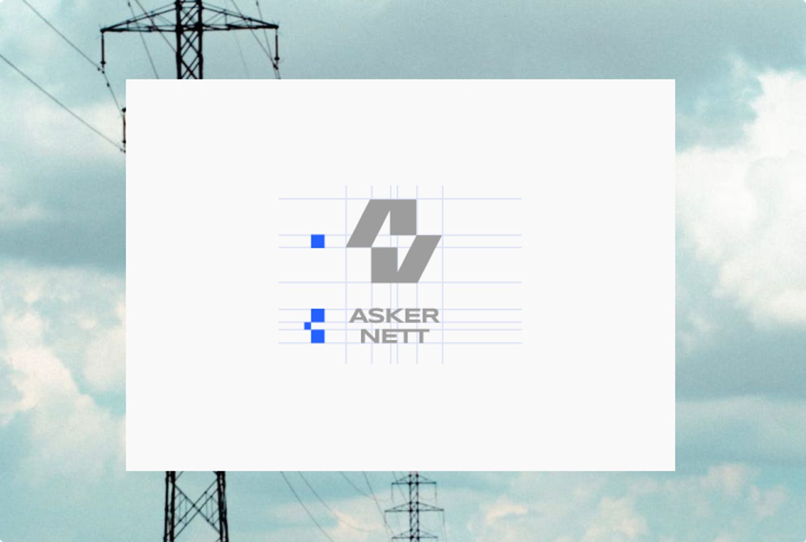
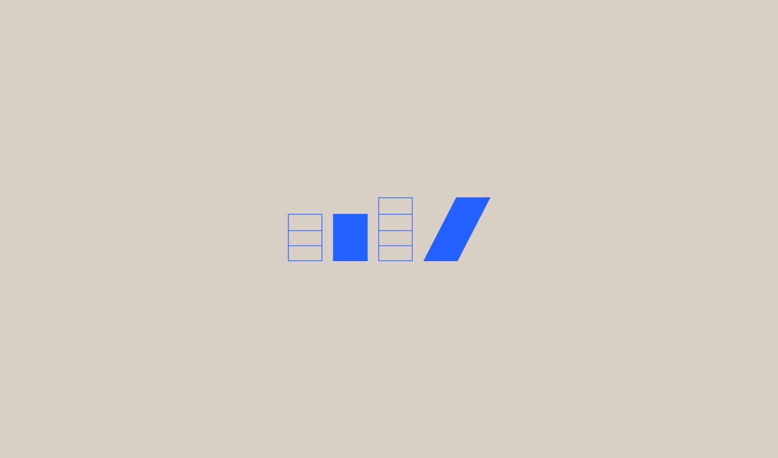
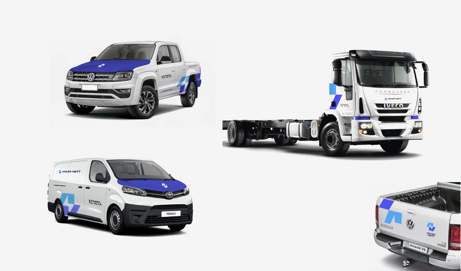
A minimalist lightning symbol, a modular line system, and a vibrant palette replace an outdated identity — and work monochrome or in full colour.
- A timeless icon
- A modular line system
- Scales from app to poster
Gallery